Rock and Chock
Chocolate packaging label series
Illustrator
Photoshop
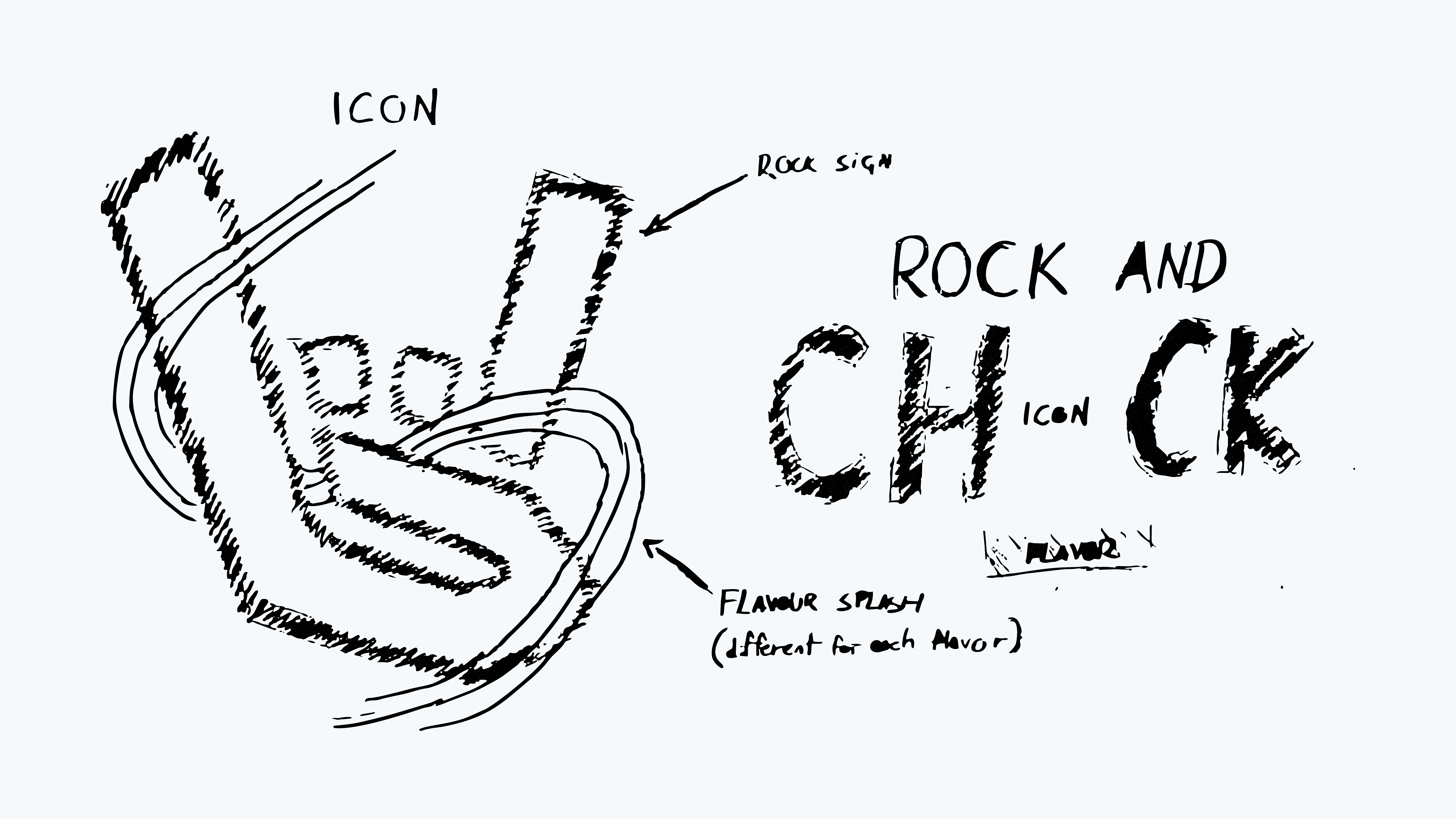
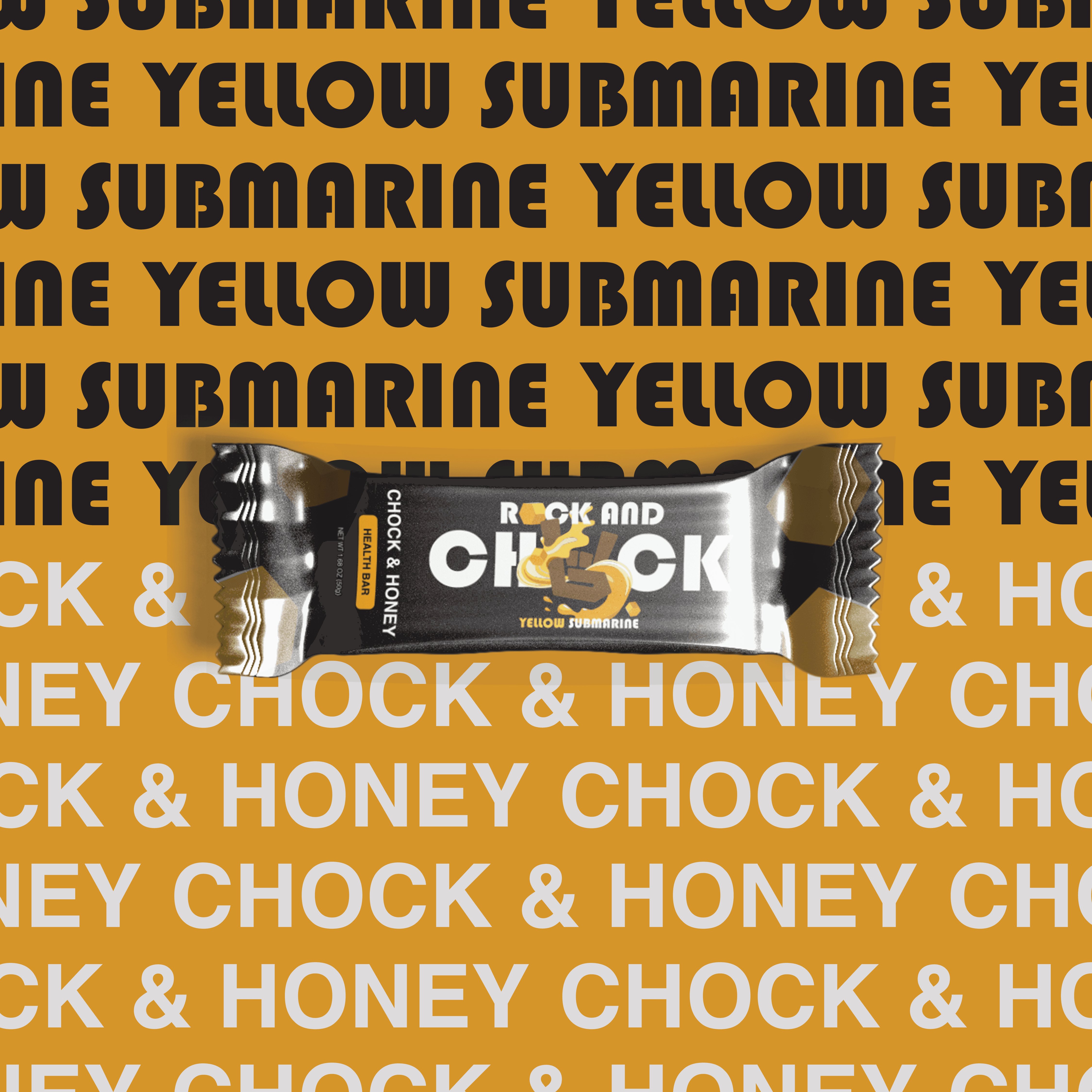
The identity for Rock and Chock takes inspiration from the energy of rock music, using bold and expressive visuals to create a playful packaging system. Each flavor has its own personality through color and naming, while a consistent layout keeps everything connected as part of one brand.
Bright colors and strong typography create a confident and eye-catching look, helping each product stand out. Rock-inspired details and subtle motion elements add to the brand’s personality, while the design stays clear and easy to understand. The result is packaging that feels fun, engaging, and unified.
The identity for Rock and Chock takes inspiration from the energy of rock music, using bold and expressive visuals to create a playful packaging system. Each flavor has its own personality through color and naming, while a consistent layout keeps everything connected as part of one brand.
Bright colors and strong typography create a confident and eye-catching look, helping each product stand out. Rock-inspired details and subtle motion elements add to the brand’s personality, while the design stays clear and easy to understand. The result is packaging that feels fun, engaging, and unified.